
CSS Customization - how to disable blog sidebar and make 3 column grid?
1 minute read
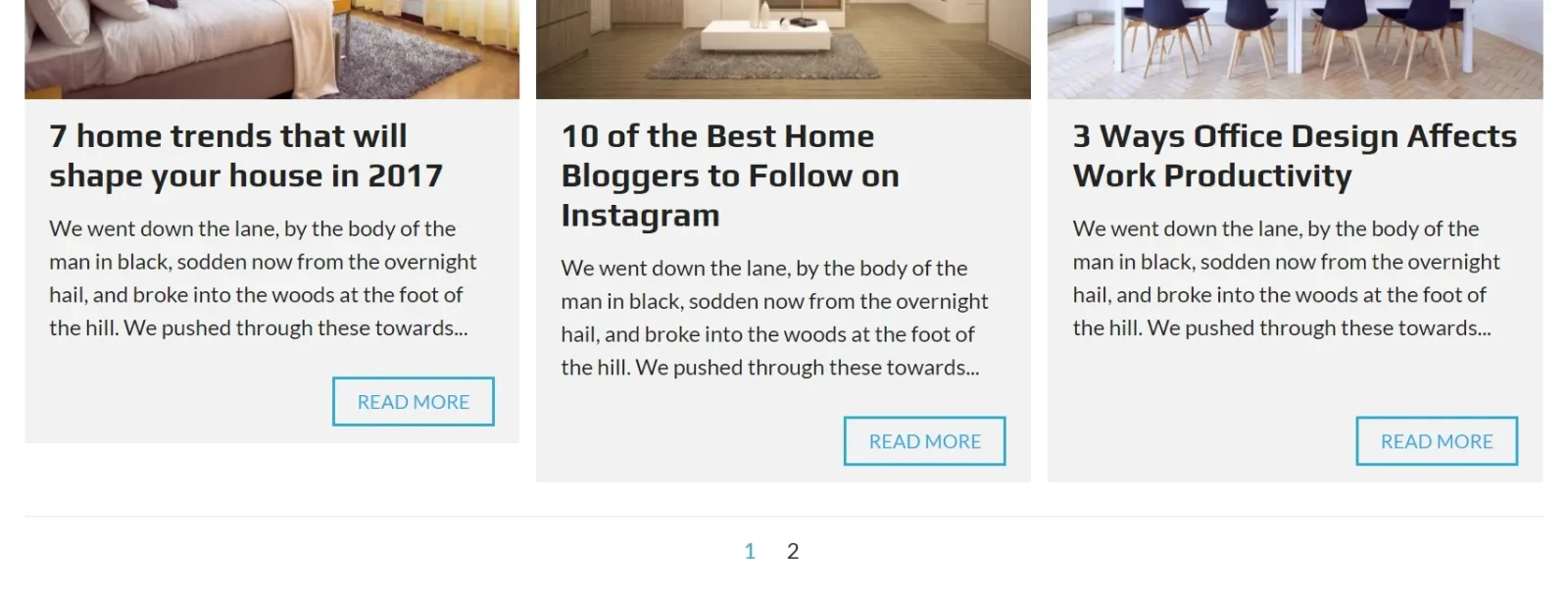
We will change 2 column grid into 3 and disable sidebar.
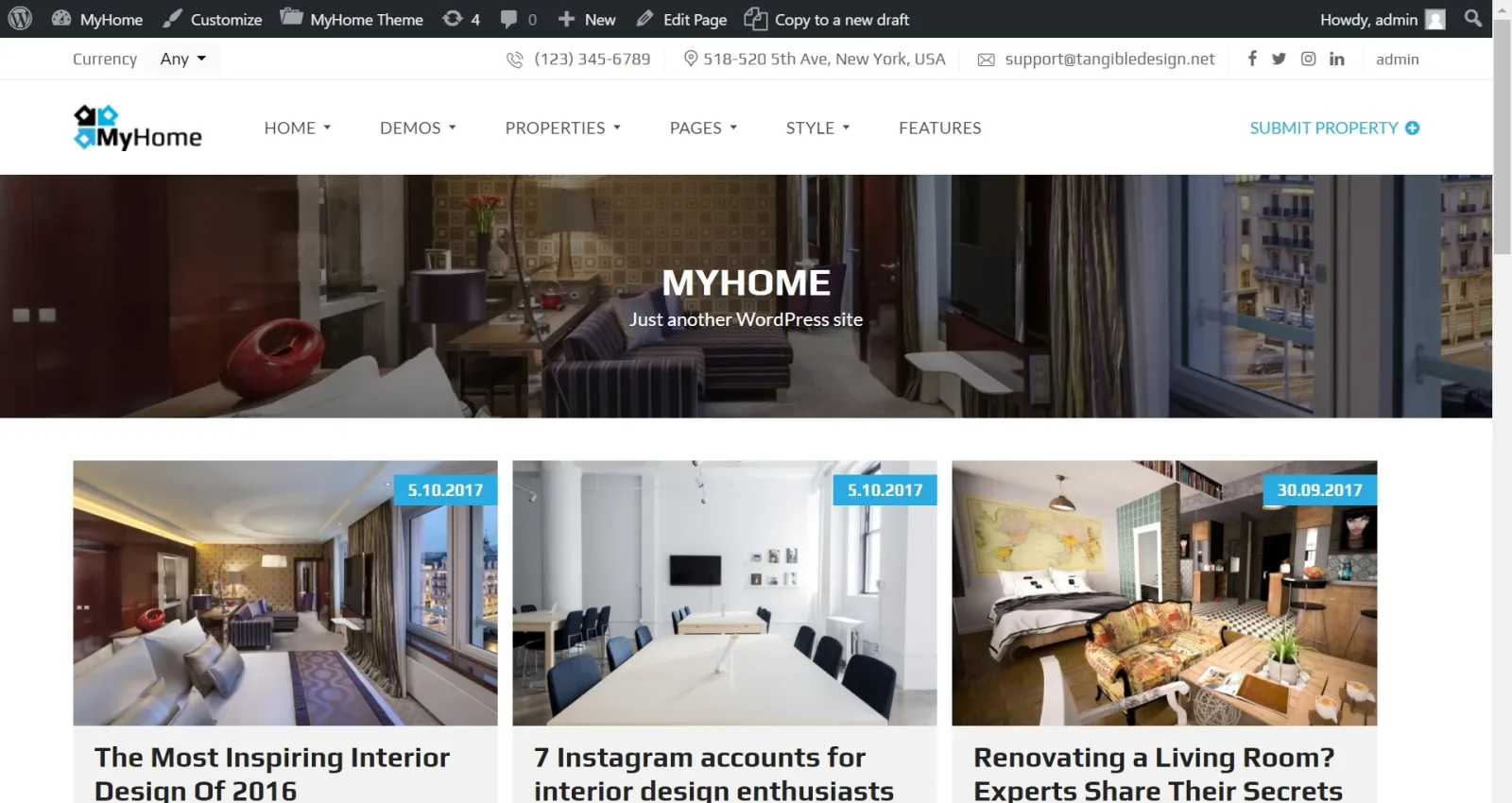
-
1
Firstly please set 2 columns
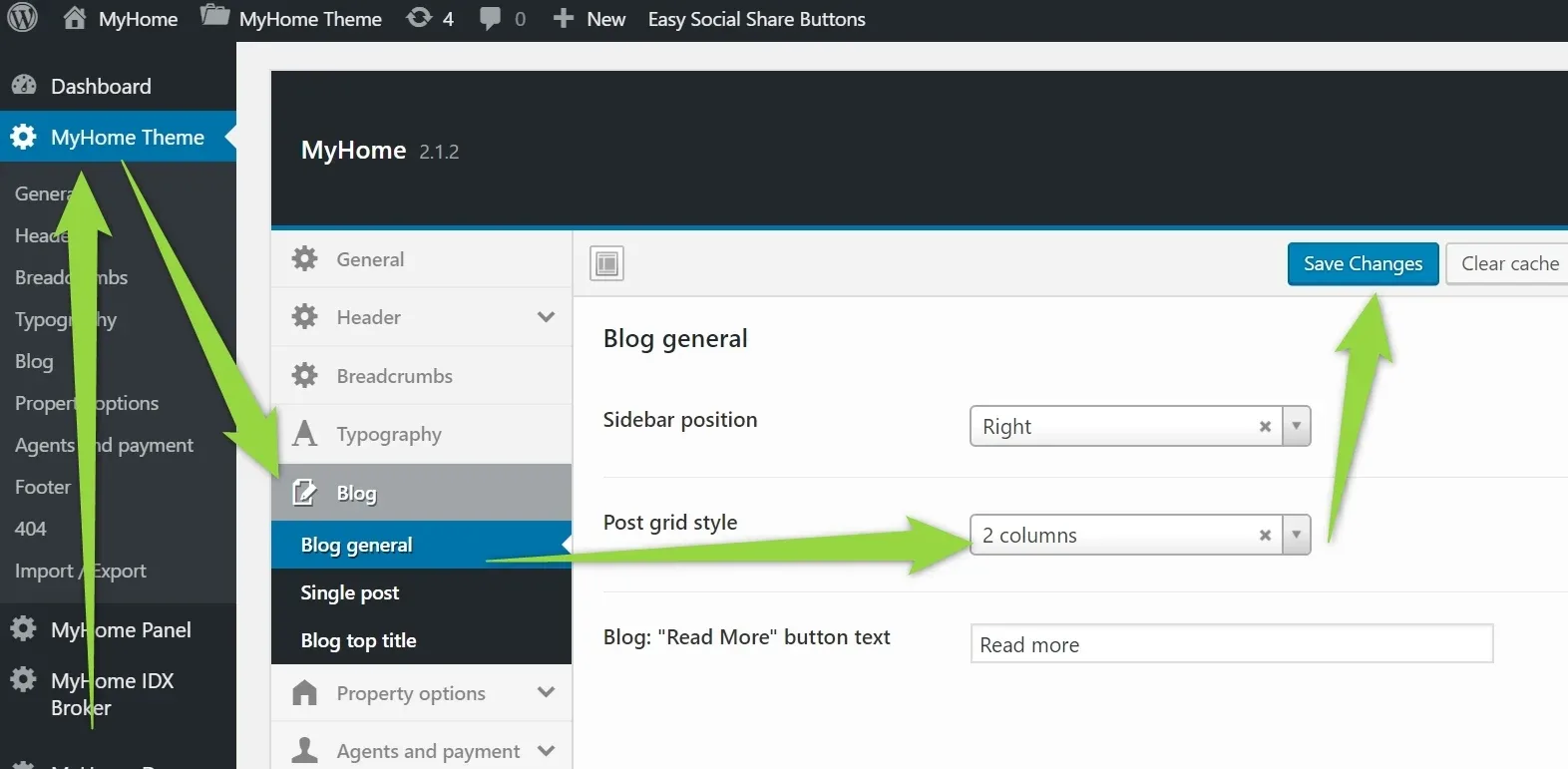
-
2
Please add this CSS below to your additional CSS ( You can read more how to add it here). It will transform 2 columns into 3 on the desktop and hide the sidebar.
css
@media (min-width:1024px) {
.archive:not(.post-type-archive-estate) .mh-grid__1of2,
.blog .mh-grid__1of2 {
width:33.3%!important;
}
}

.archive:not(.post-type-archive-estate) .mh-layout__sidebar-right,
.blog .mh-layout__sidebar-right {
display:none!important;
}

.archive:not(.post-type-archive-estate) .mh-layout__content-left,
.blog .mh-layout__content-left {
width:100%!important;
}
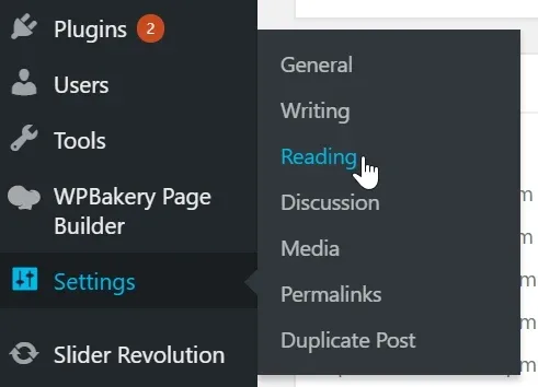
3. You can visit your setting and change default max number of posts per page "10" to e.g. 12 so the pagination will always look good (when there are 2 columns on tablet or 3 columns on pc).
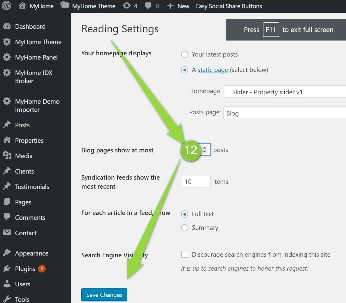
12 elements:
Ask the people who build MyHome WPBakery
We answer by email from support@tangiblewp.com. With Premium Support, we also fix your site when something breaks.
We can also run your site for you, or build a new one.
Was this guide helpful?